TygrLabs
A new identity for a company ready to become something bigger.
The system was built to reflect that evolution, moving beyond what the brand had been known for and creating an identity broad enough to support new ideas, new ventures, and wherever the company goes next.
Existing Brand
Tygrlabs had evolved far beyond its original identity. As the studio expanded its capabilities, the brand needed to reflect a broader and more ambitious practice rather than a single discipline. The goal wasn’t to simply redesign the logo. It was to create a visual language capable of growing with the studio.
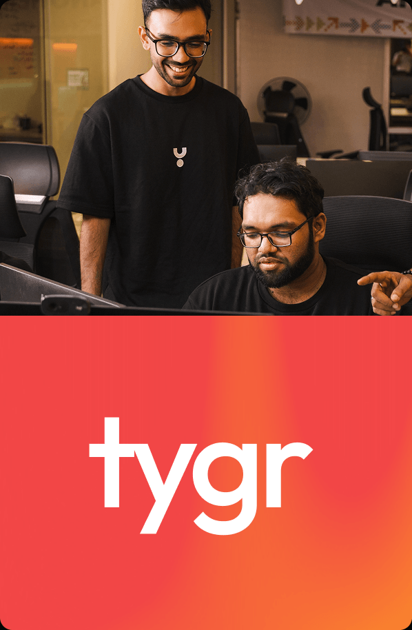

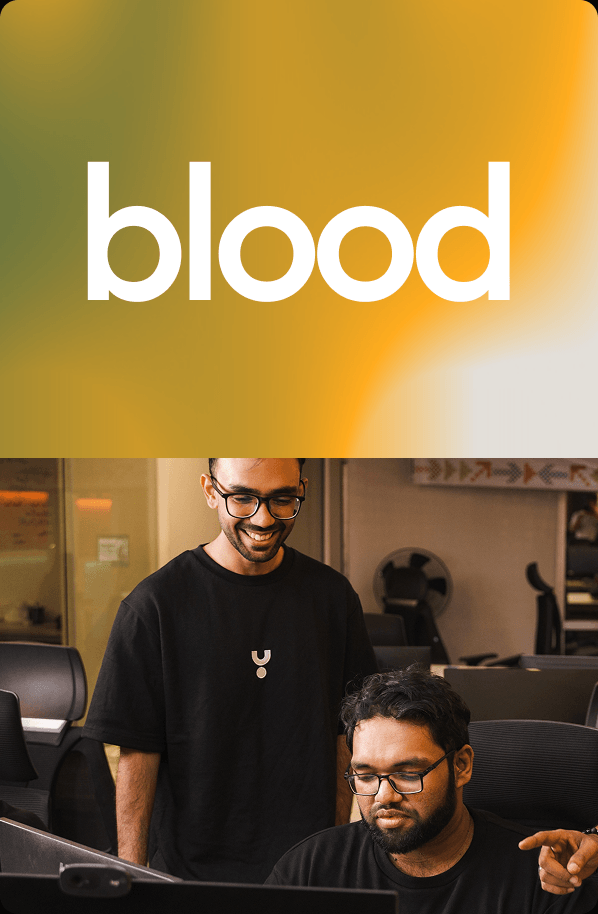
The identity lives between structure and experimentation. A restrained typographic foundation creates consistency, while expressive imagery, saturated color, and unexpected compositions give the brand its energy. The result feels deliberate without becoming overly polished or predictable.
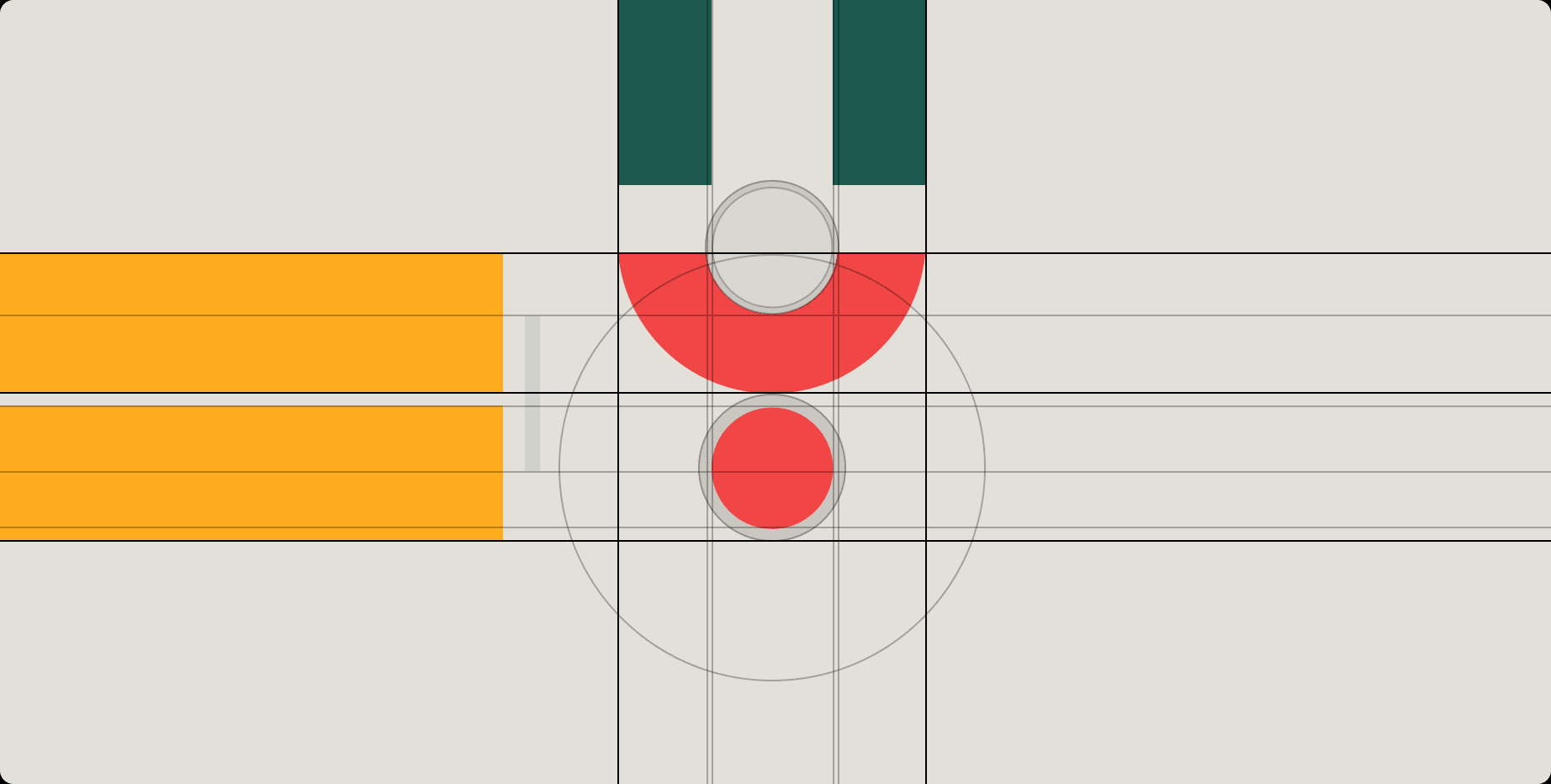
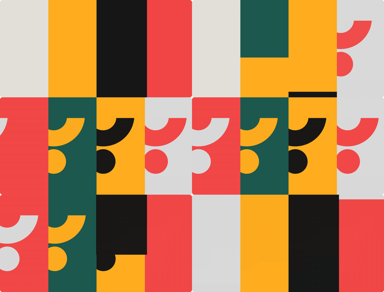
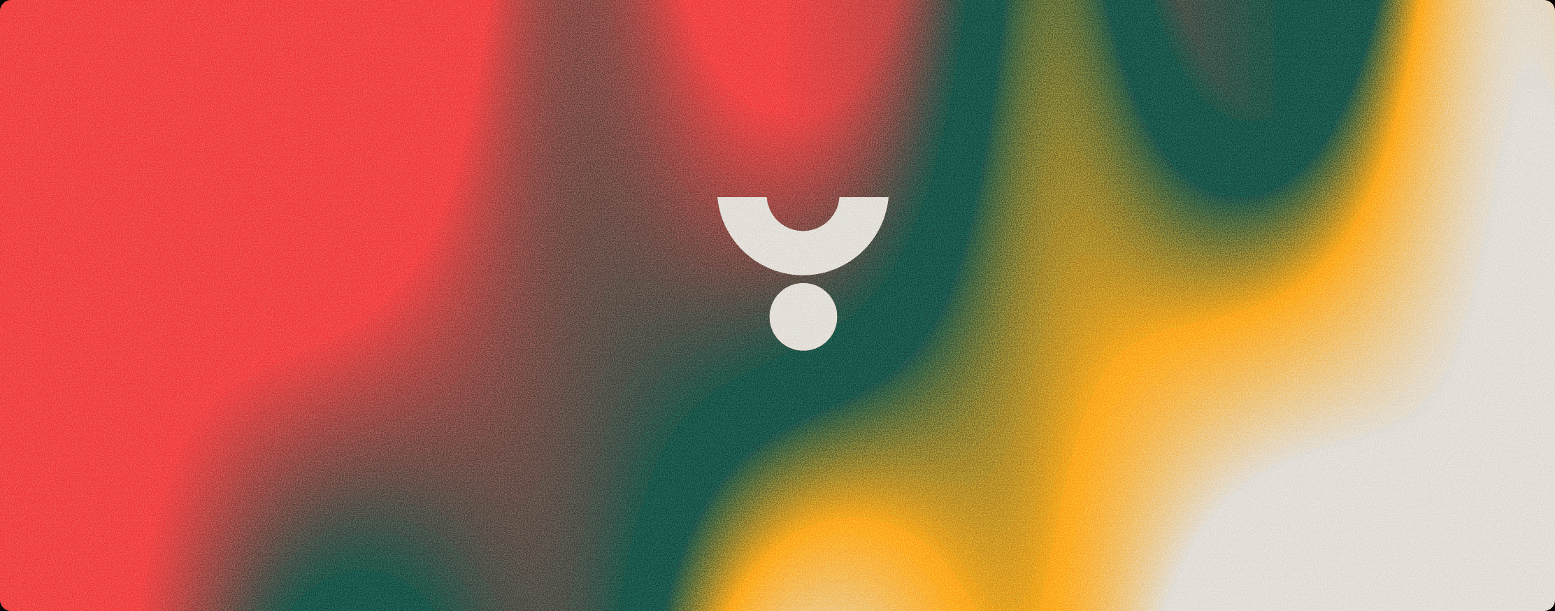
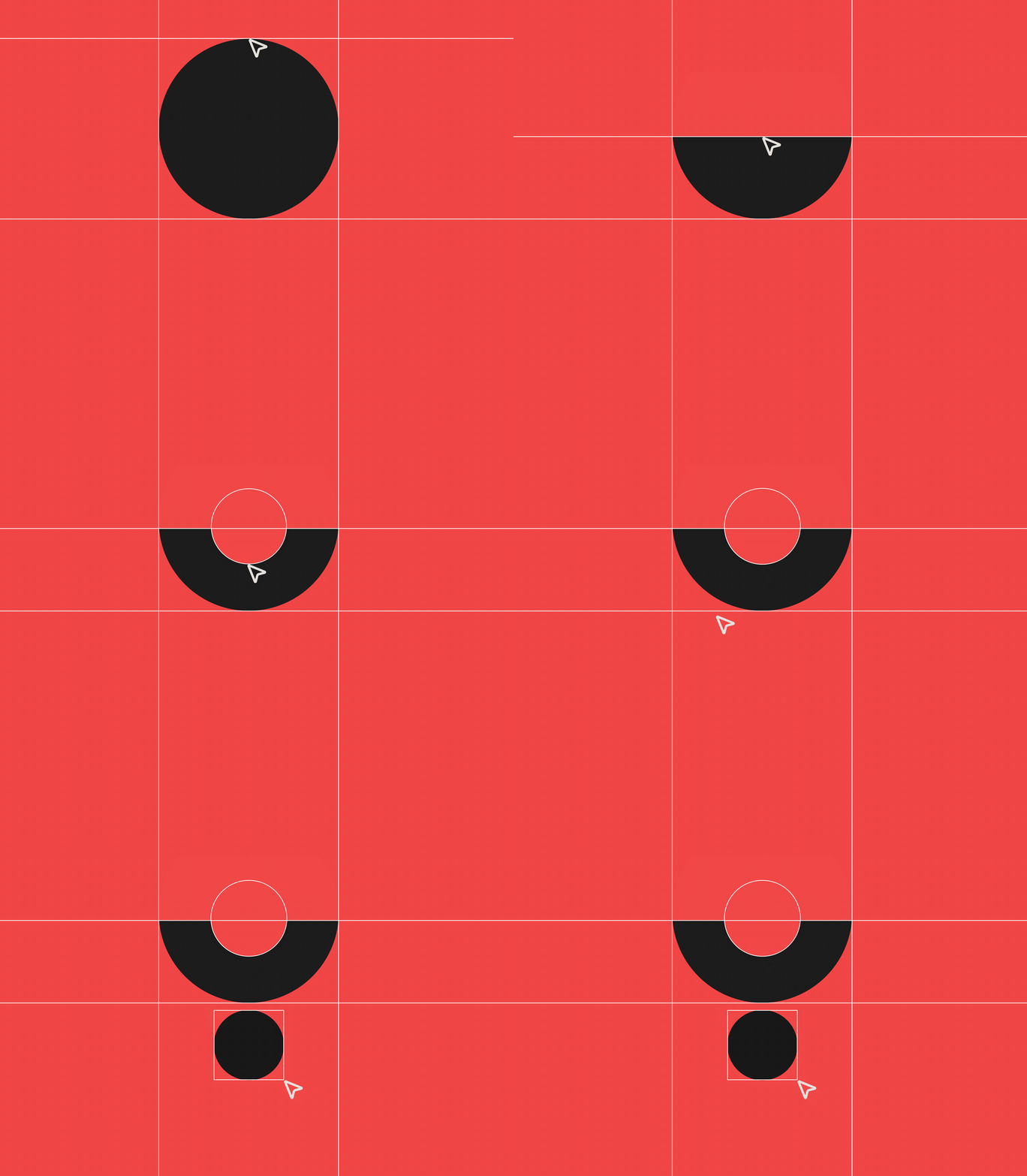
The mark was constructed around simple geometric relationships, creating a recognizable form that can be repeated, cropped, scaled, and reinterpreted. Instead of treating the logo as a static signature, the geometry became part of the broader visual language.
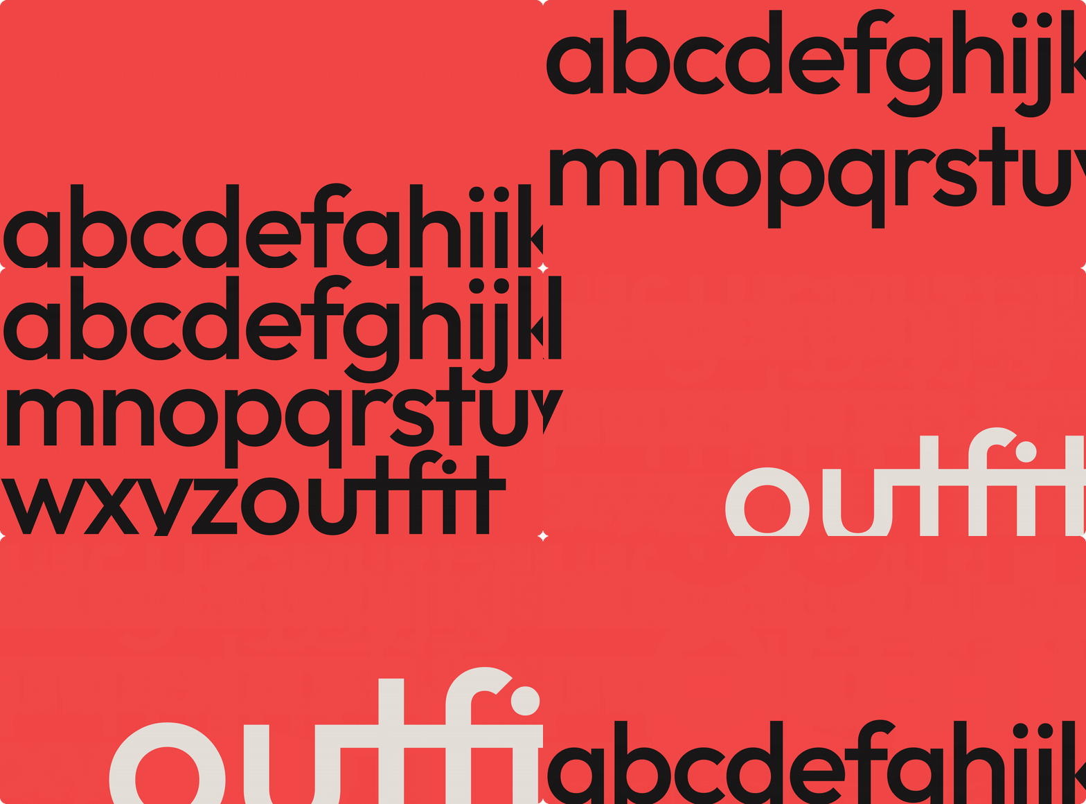
The typographic system moves between quiet, functional information and oversized editorial expression.
Large type becomes an image in itself, while smaller typography keeps product, business, and technical communication clear and structured.
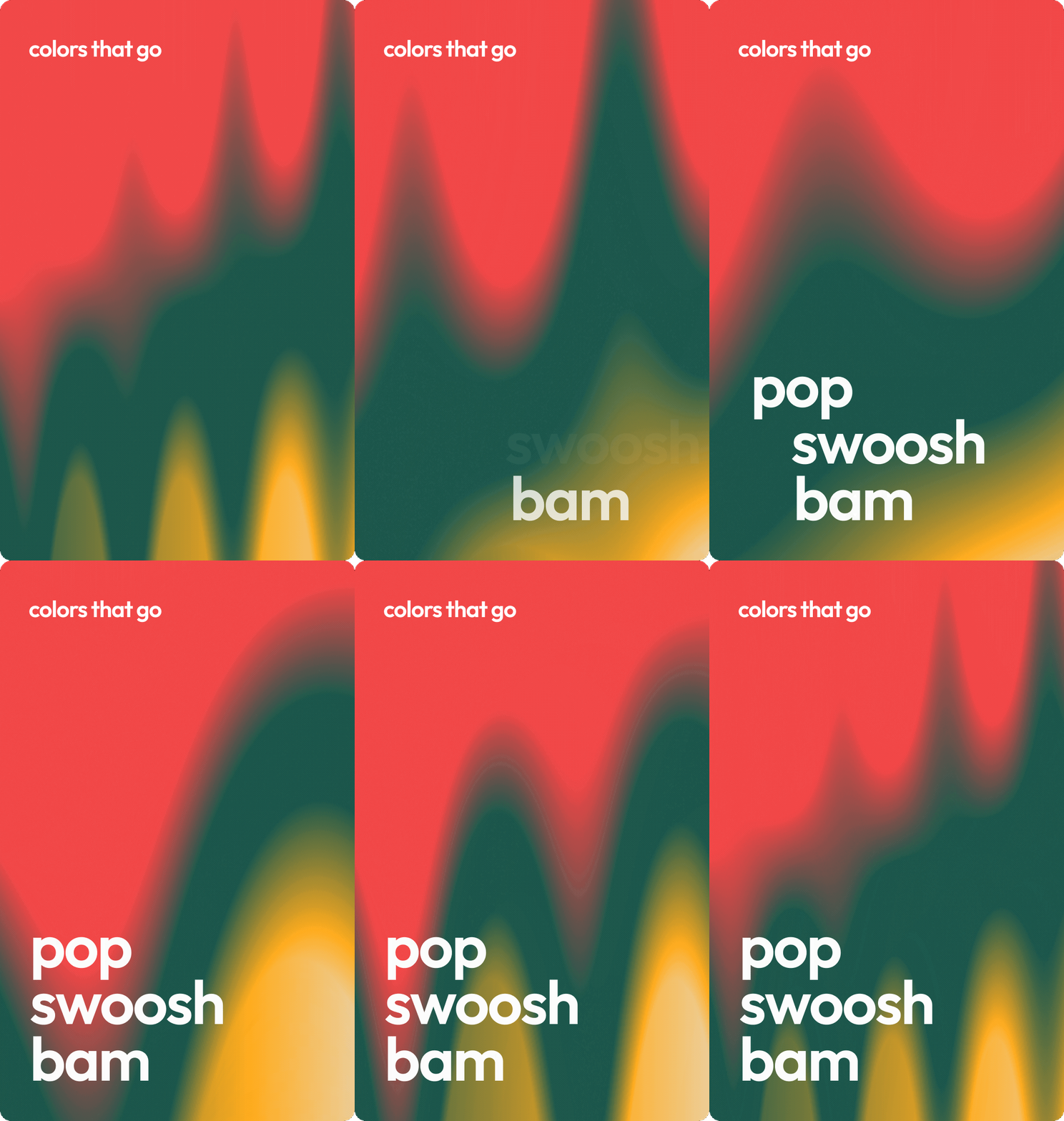

A compact palette keeps the identity immediate and recognizable. Warm neutrals establish the foundation, while yellow, red, and black create contrast and give the system its characteristic energy.
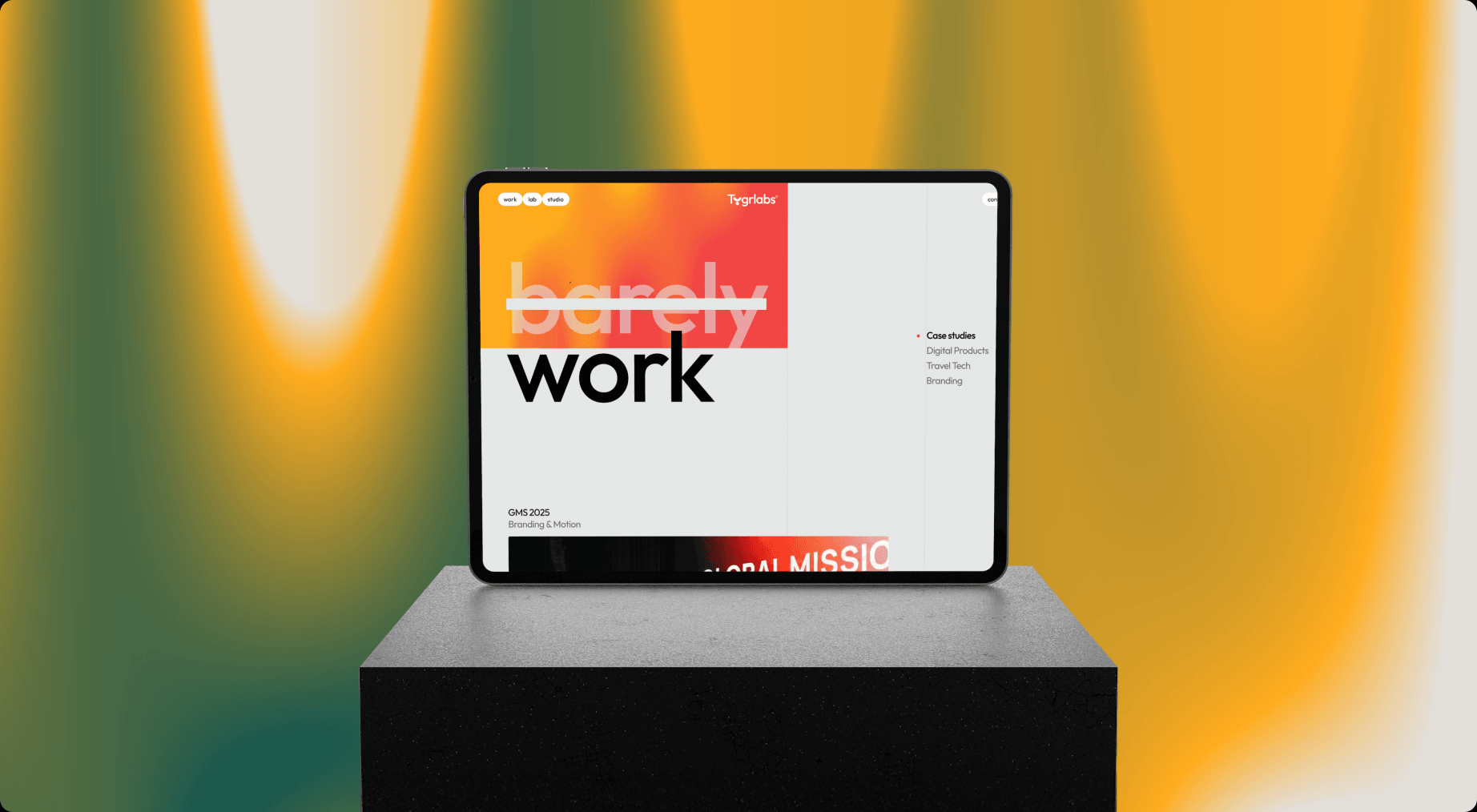
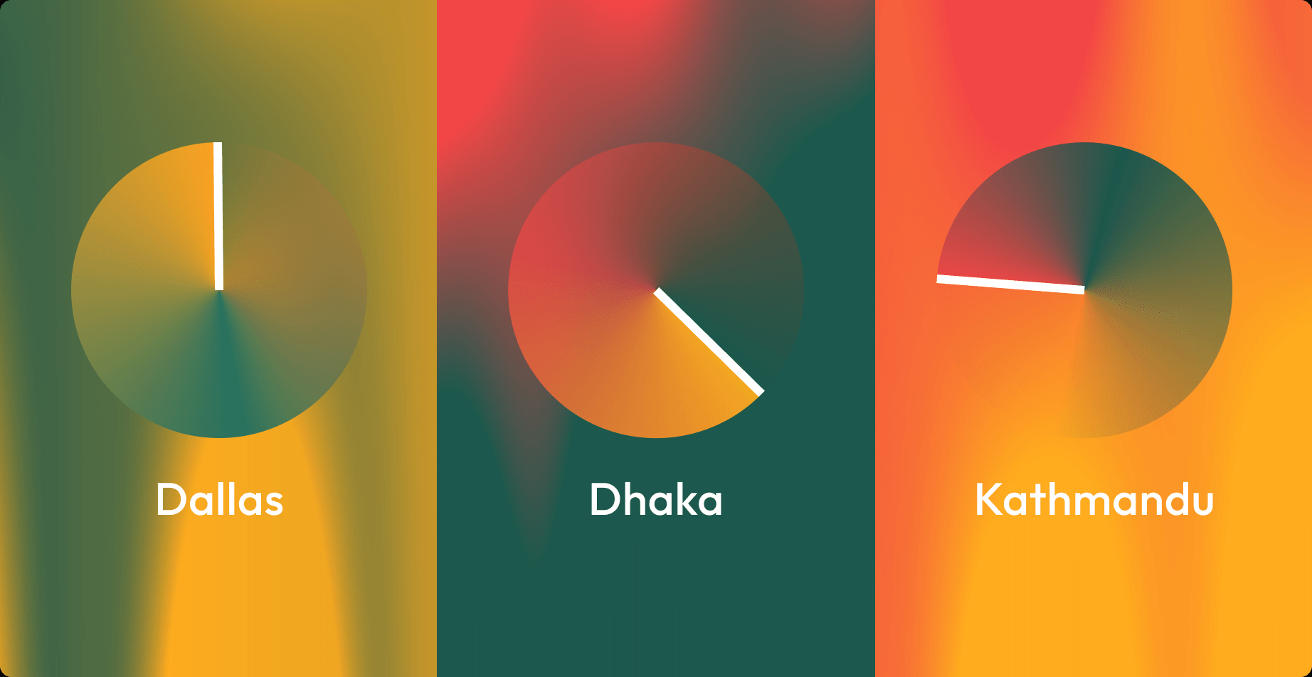
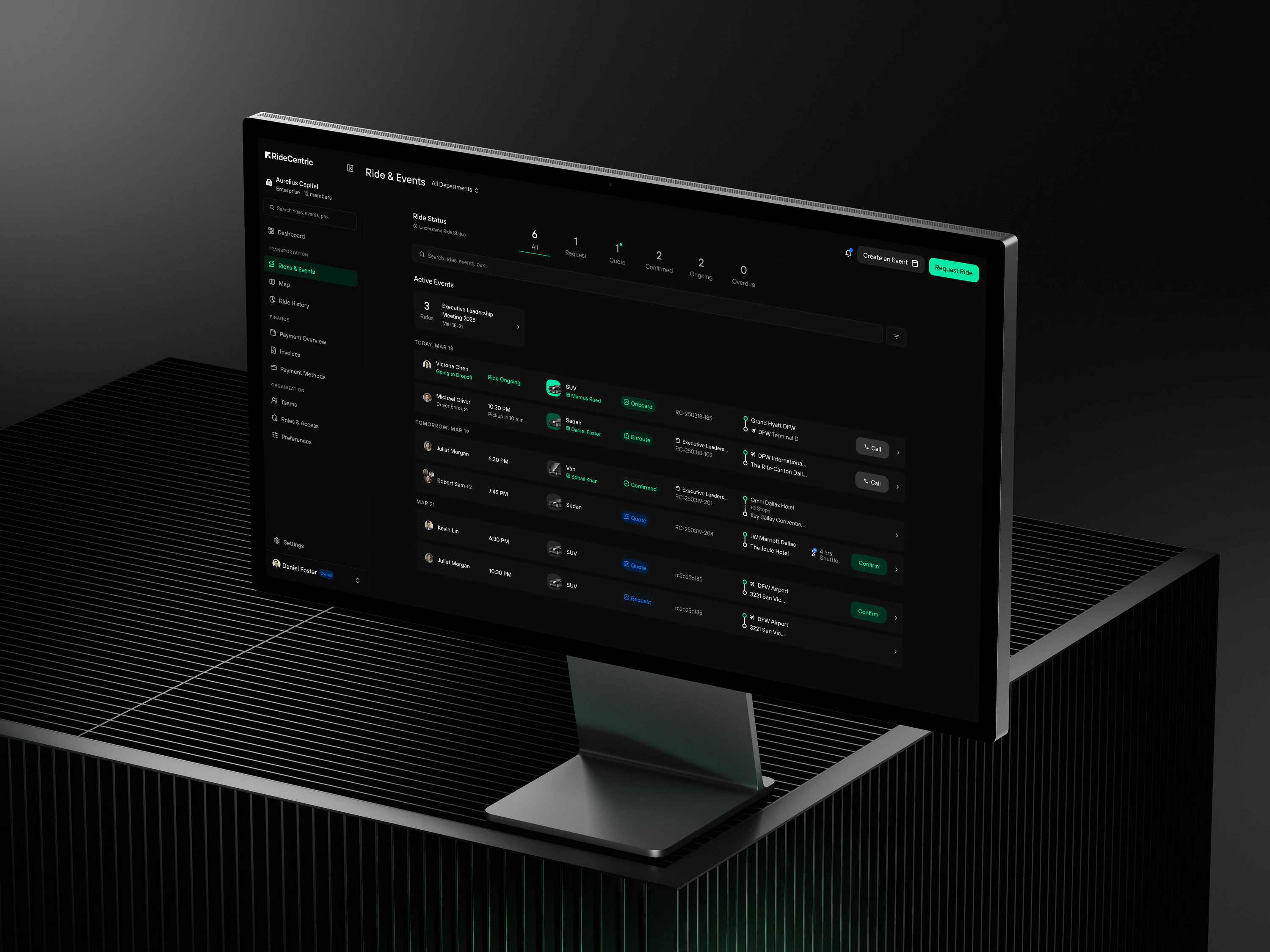
The digital identity extends the same principles into interaction. Typography shifts in scale, gradients become atmospheric spaces, and graphic elements respond through movement.
Motion isn’t added as decoration. It gives the identity another dimension and makes the brand feel alive on screen.
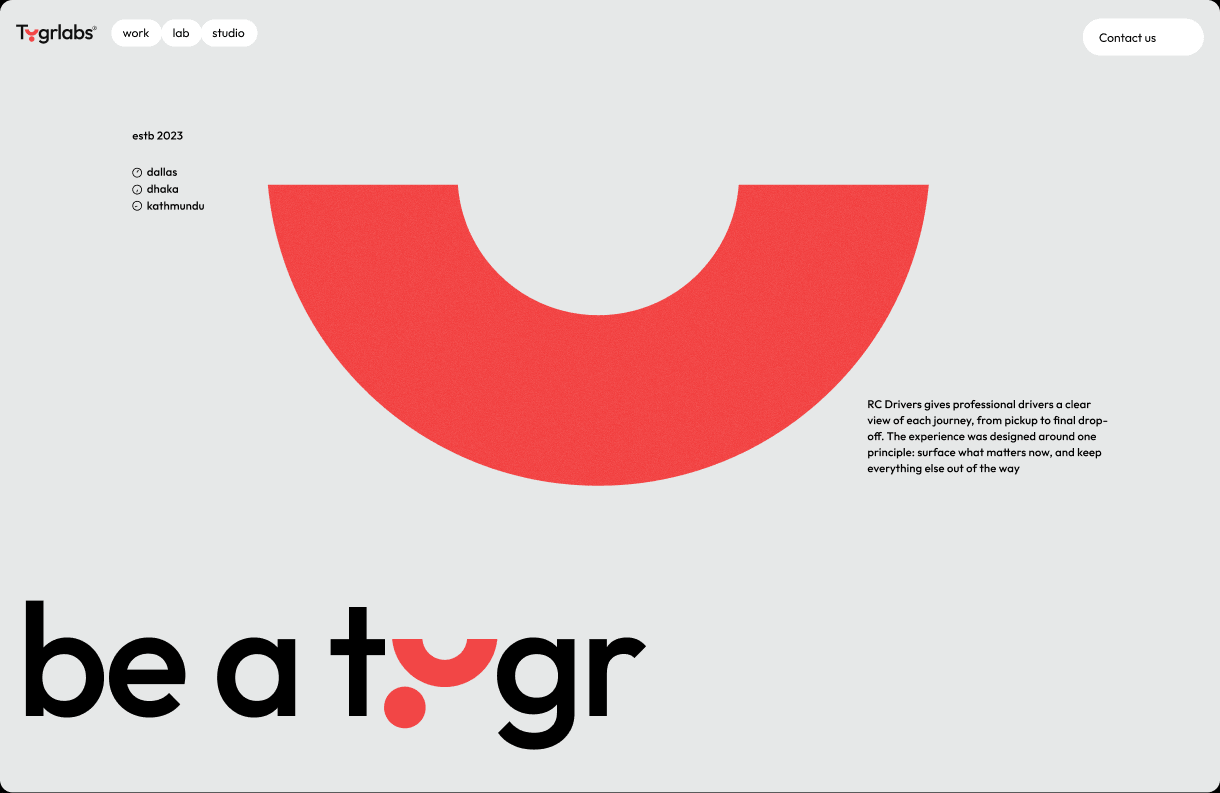
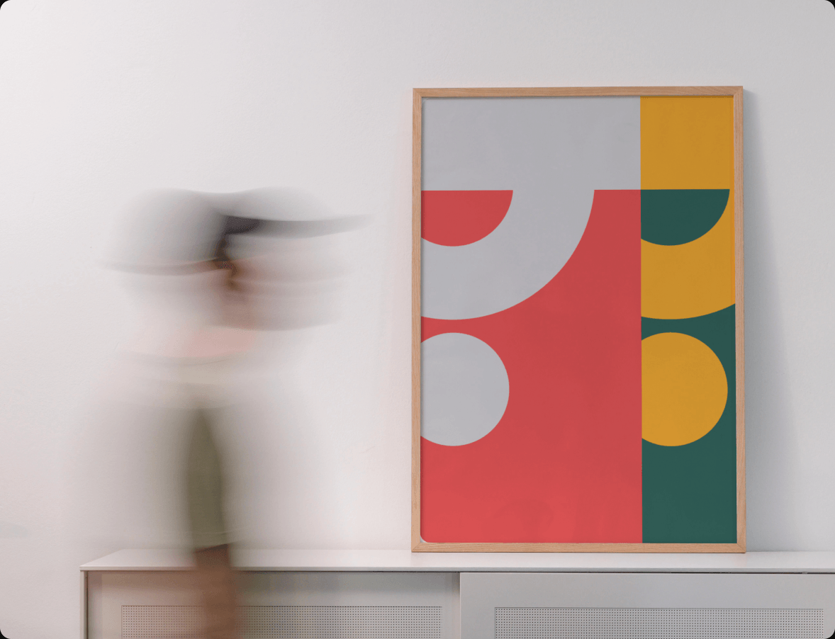
The system was intentionally created to work beyond digital interfaces. Strong typography, simple geometry, and high-contrast color translate naturally into printed matter, merchandise, environmental graphics, and physical objects.
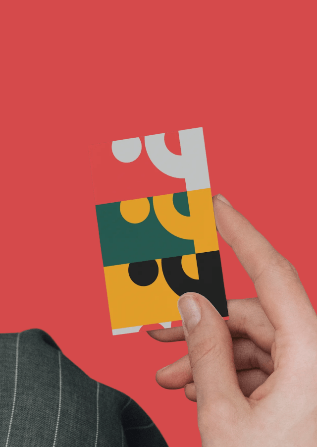
The final system gives Tygrlabs a recognizable foundation without locking the brand into a single visual style.
It can be precise or expressive, quiet or loud, digital or physical, while still feeling like the same brand.
One system. Many expressions.